Design, Art Direction & Ceramic
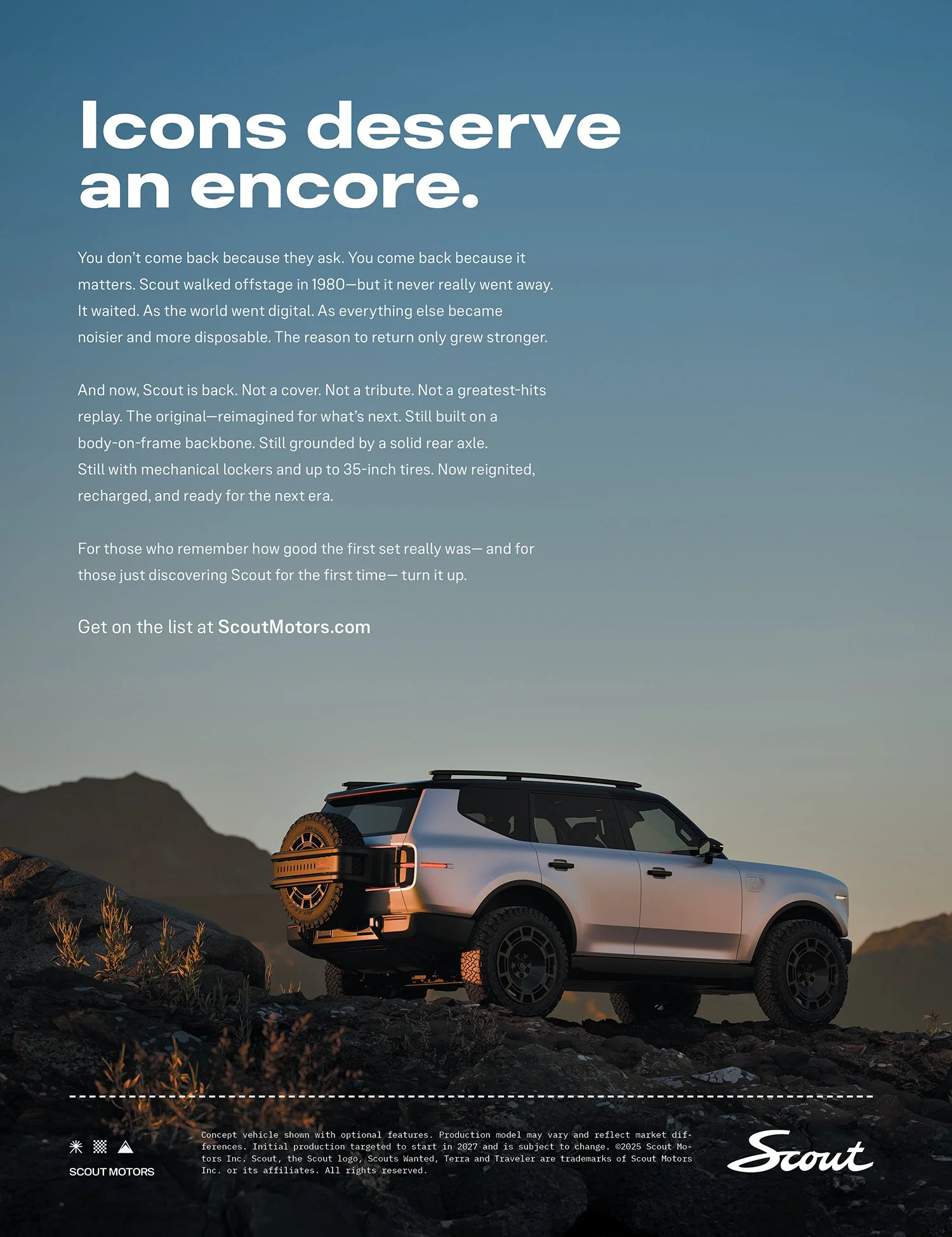
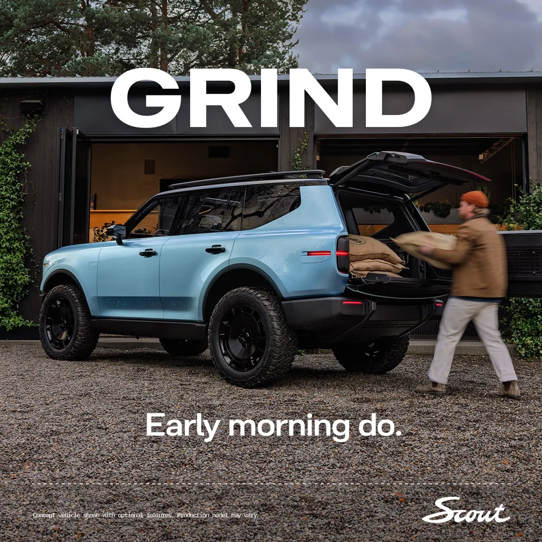
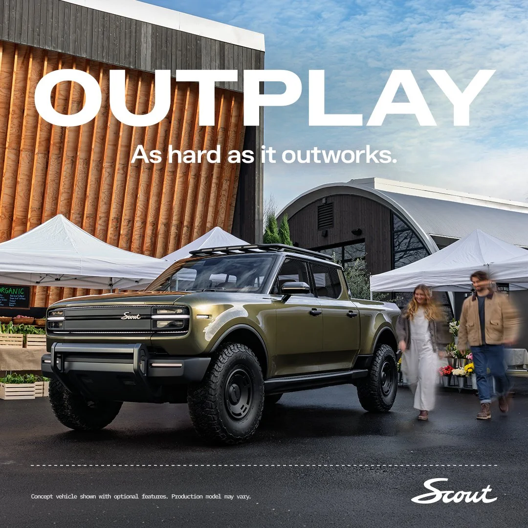
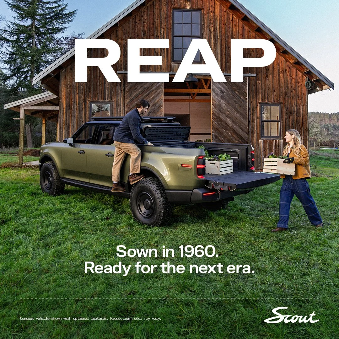
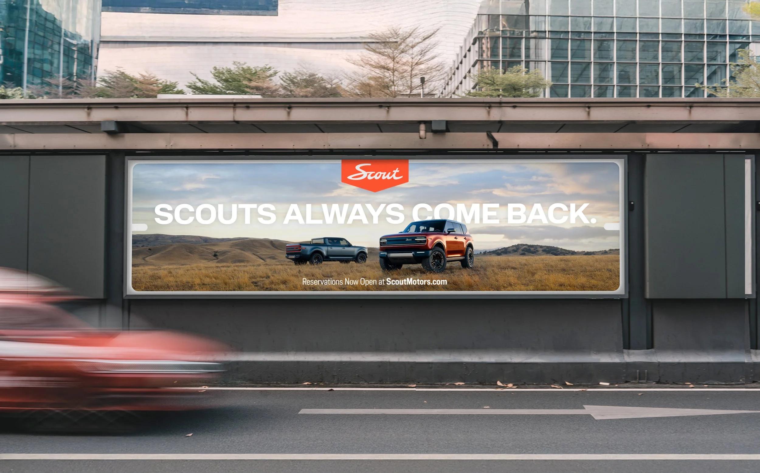
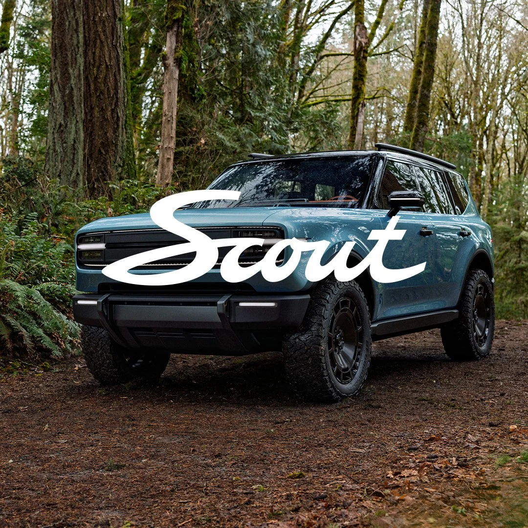
Scout Motors is an iconic heritage brand steeped in tradition and recently re-launched as an electric vehicle. I’ve designed and art direct multiple campaigns to help drive reservations.
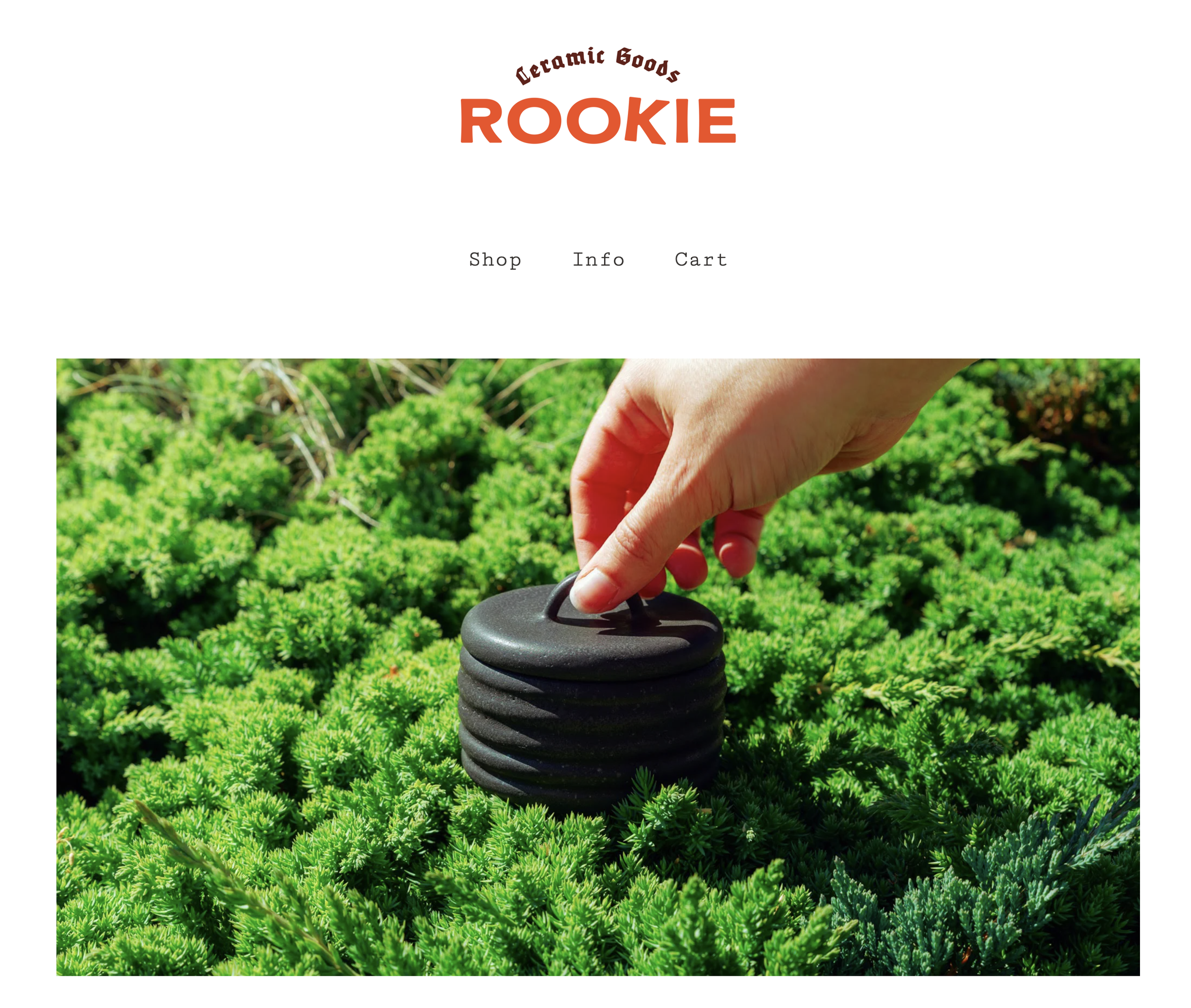
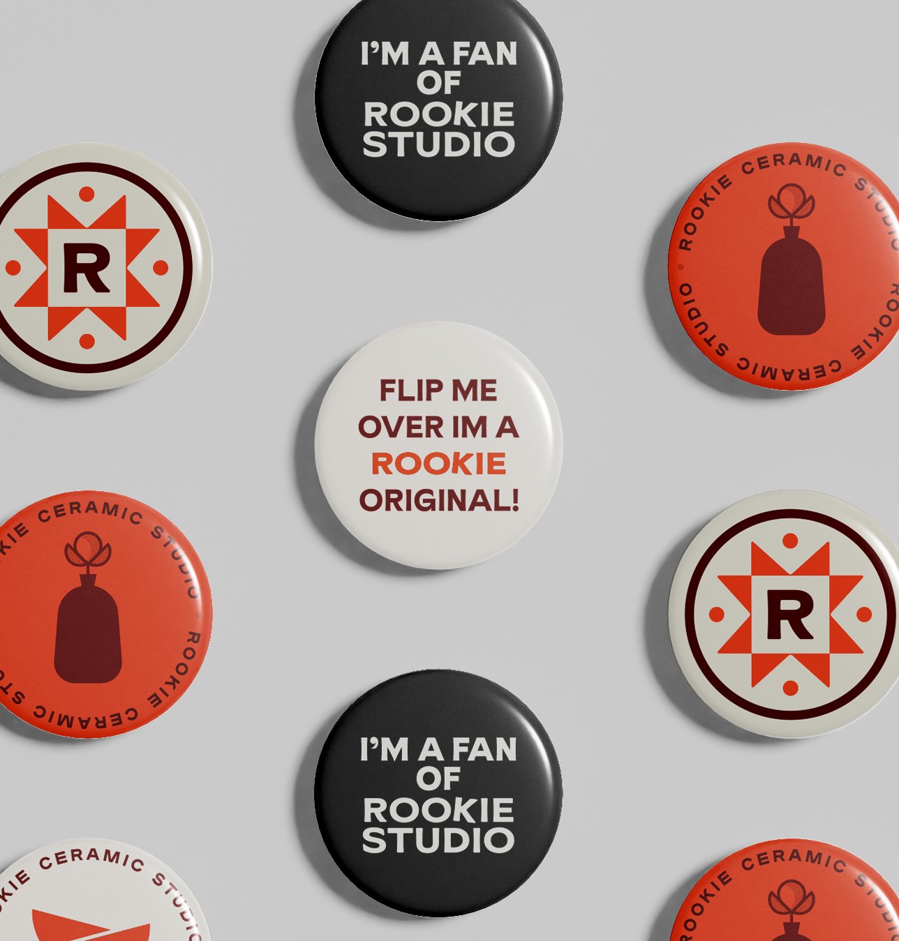
Branding for my own small ceramics business. Even though I’m a well-seasoned creative, the name Rookie really resonates with my creative journey. I find so much joy in learning and tweaking my creative process, getting into the shit and really messing around. I wanted my brand to reflect the playfulness of my process and the refinement of my finished pieces.
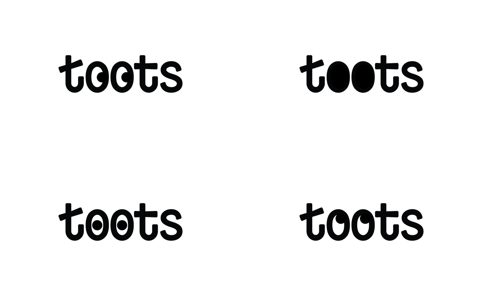
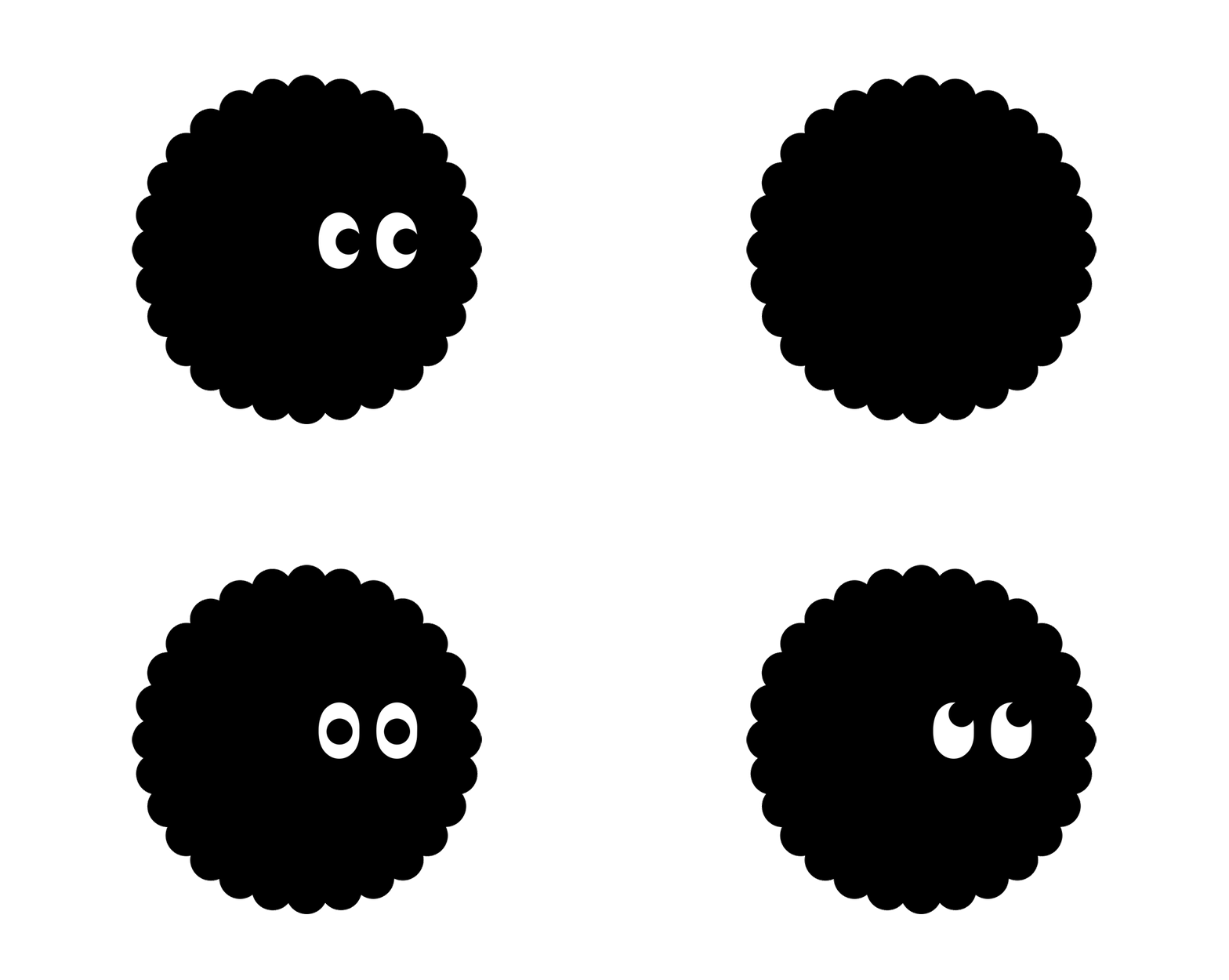
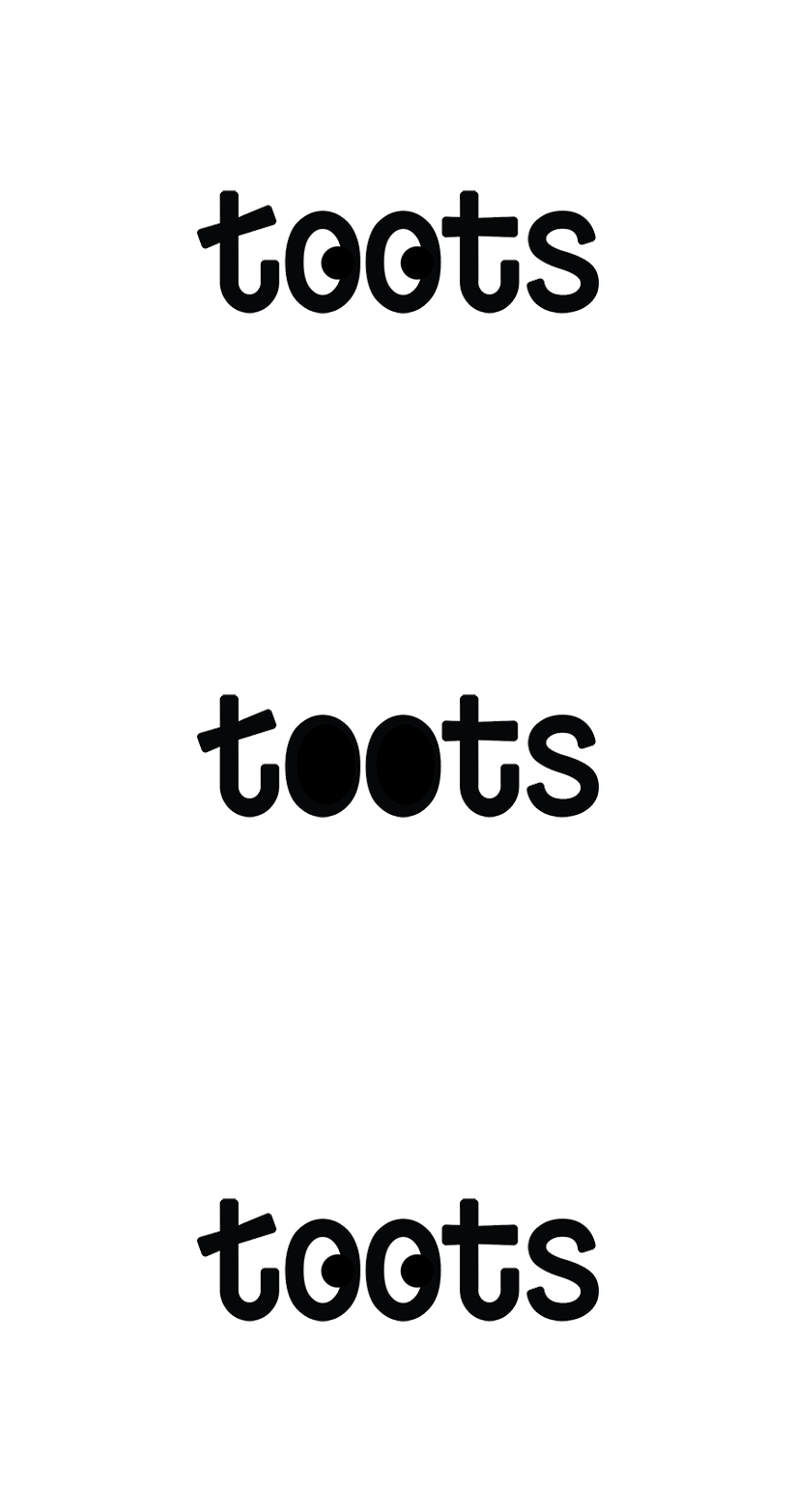
My good friend and owner of Toots needed a brand refresh to take her small, hand-sewn stuffed animal business to the next level. I wanted this system to be able to flex and feel fresh with tons of color & character combinations so it could grow with her. I had an absolute blast building this design system for them.
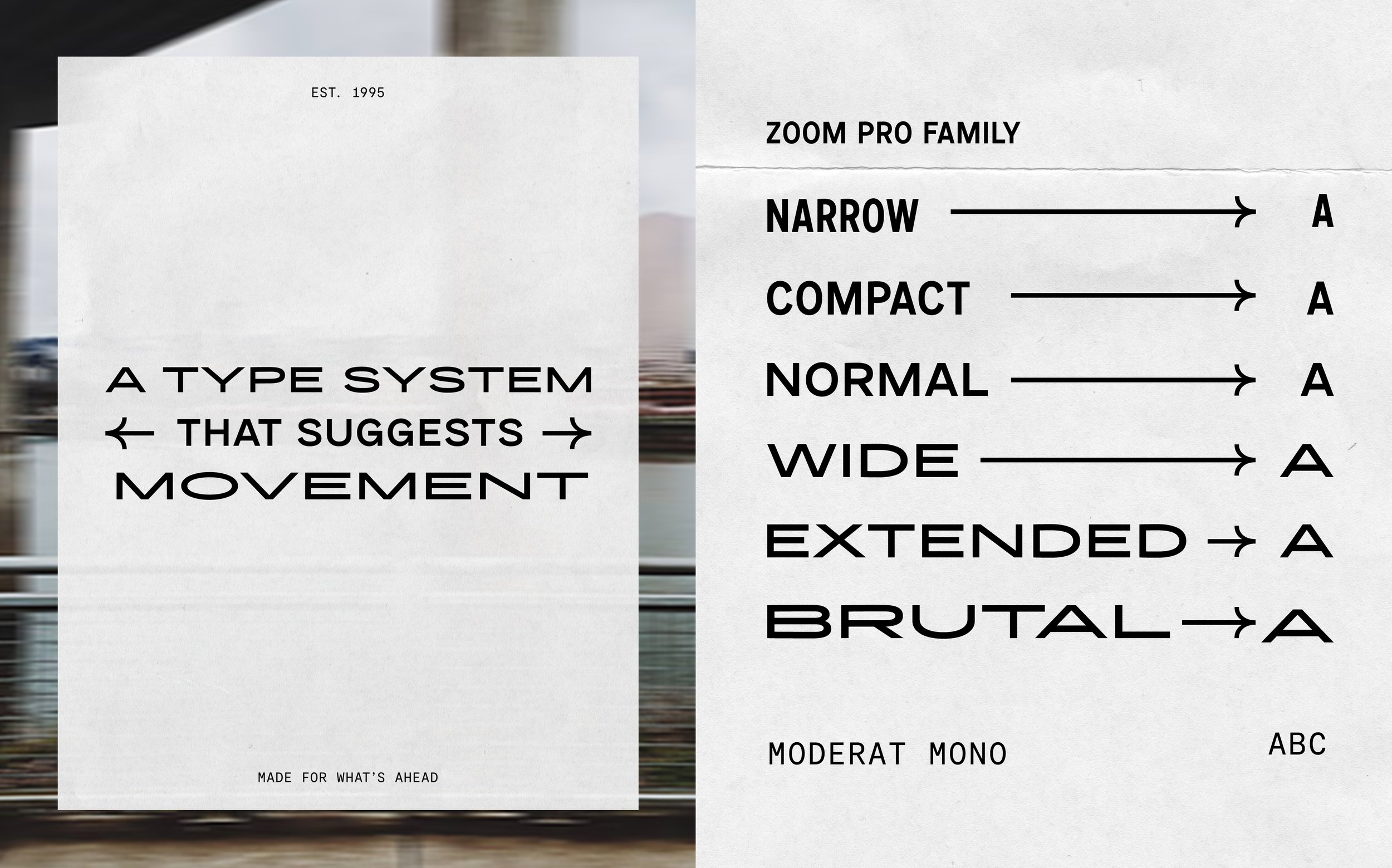
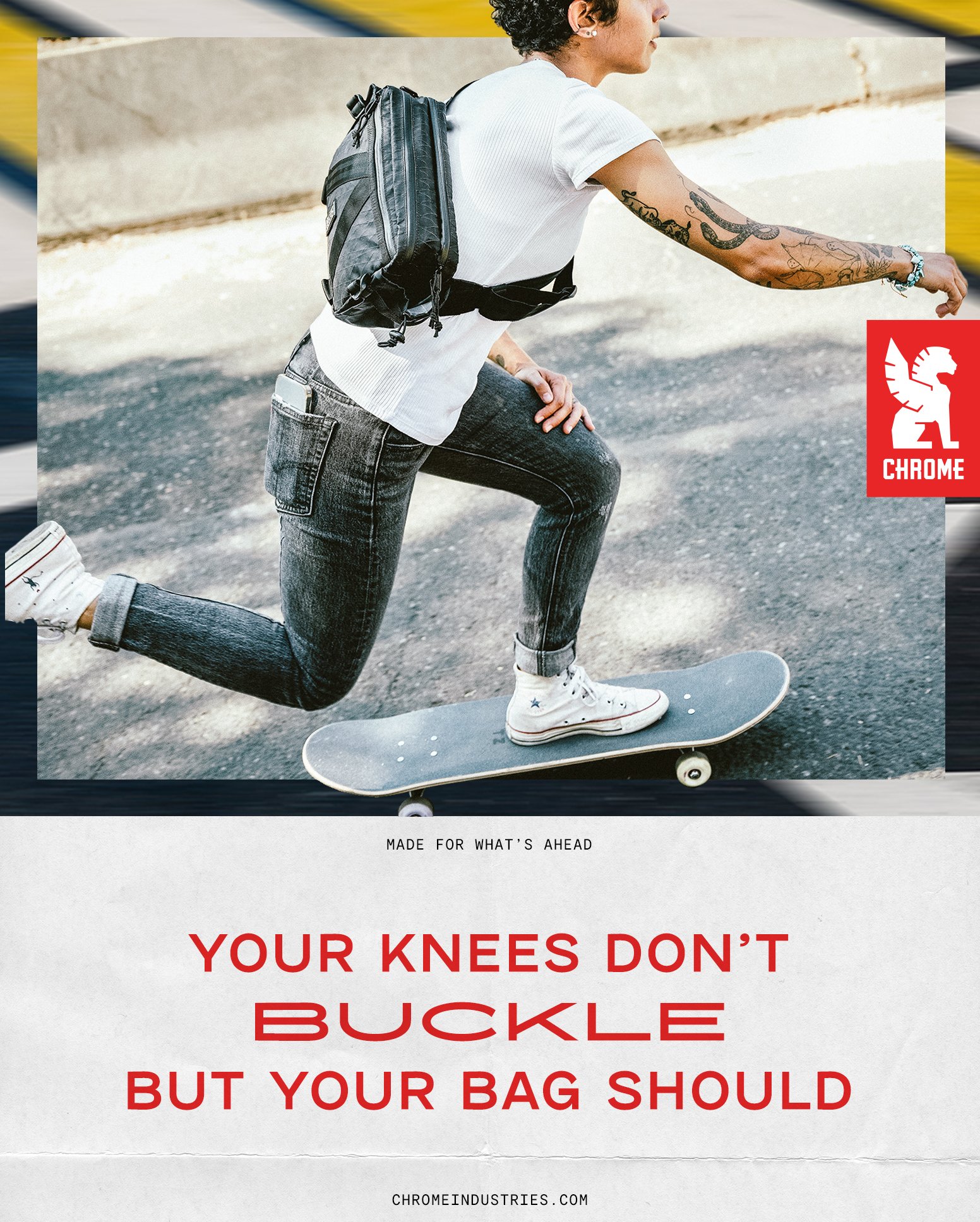
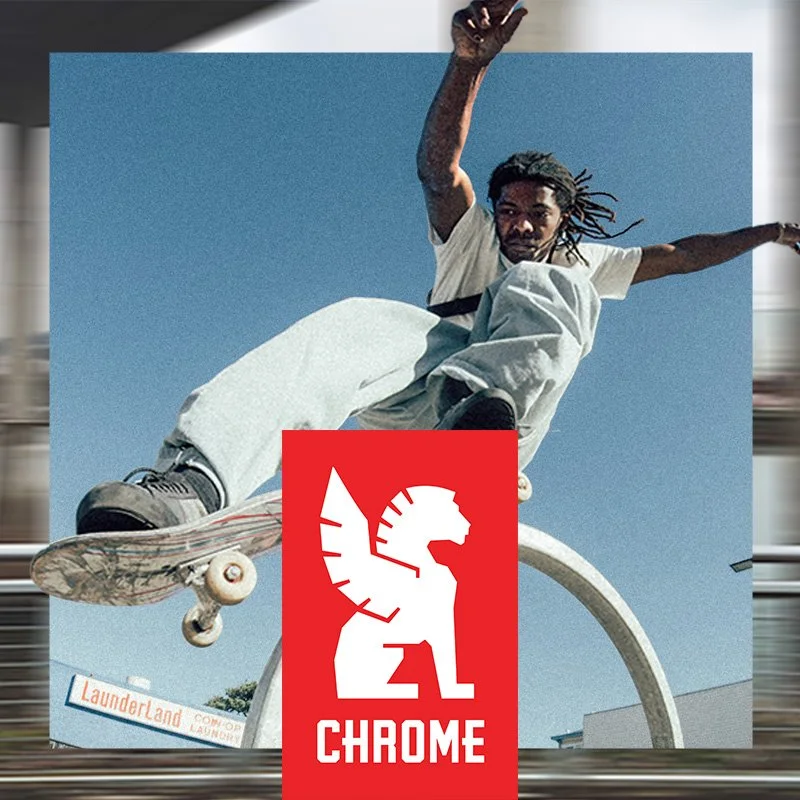
I recently built an identity & logo refresh for Chrome Industries. My goal was for this branding to feel kinetic, like you were moving through city streets on a bike, even in static placements. Photography is split into 2 areas, blurred textural spaces and traditional product & lifestyle with a type system that stretches and flows.
Art Direction & Design for Visible Mobile by Verizon
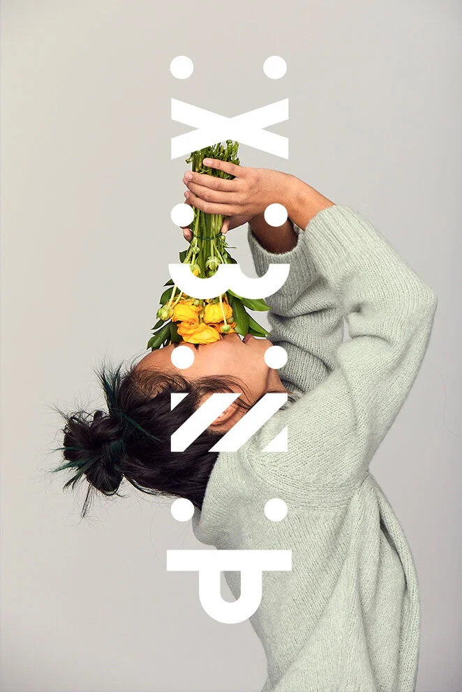
Built around the idea of “Mobile for All” I helped bring the visual ID to life with logo design, layouts, art direction and brand guidelines. Working with the photographer Meredith Jenks, we created a library of vibrant and graphic photography to help give the ID a playful and modern feel.
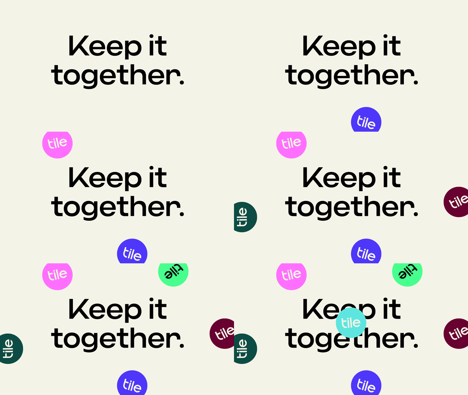
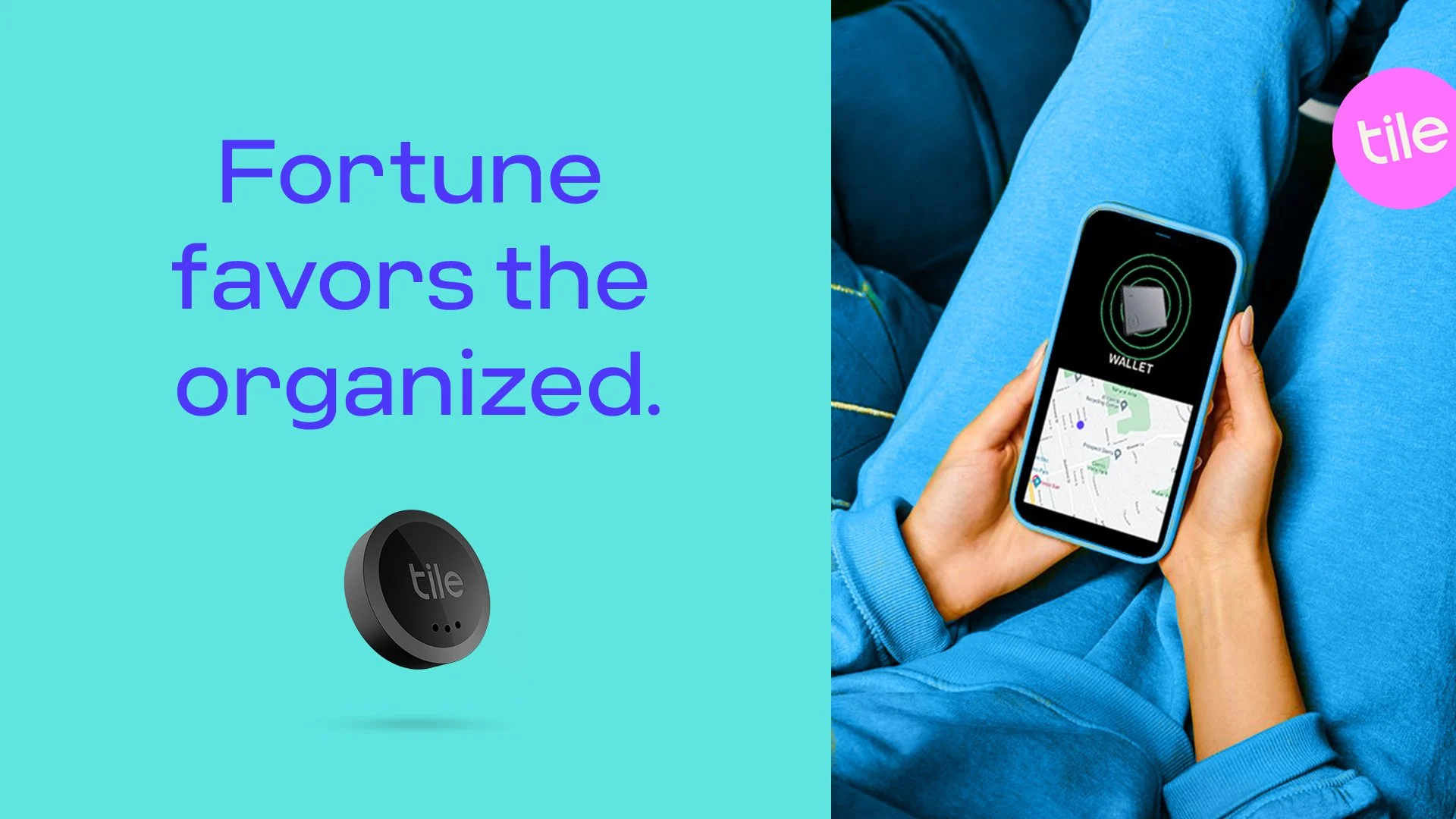
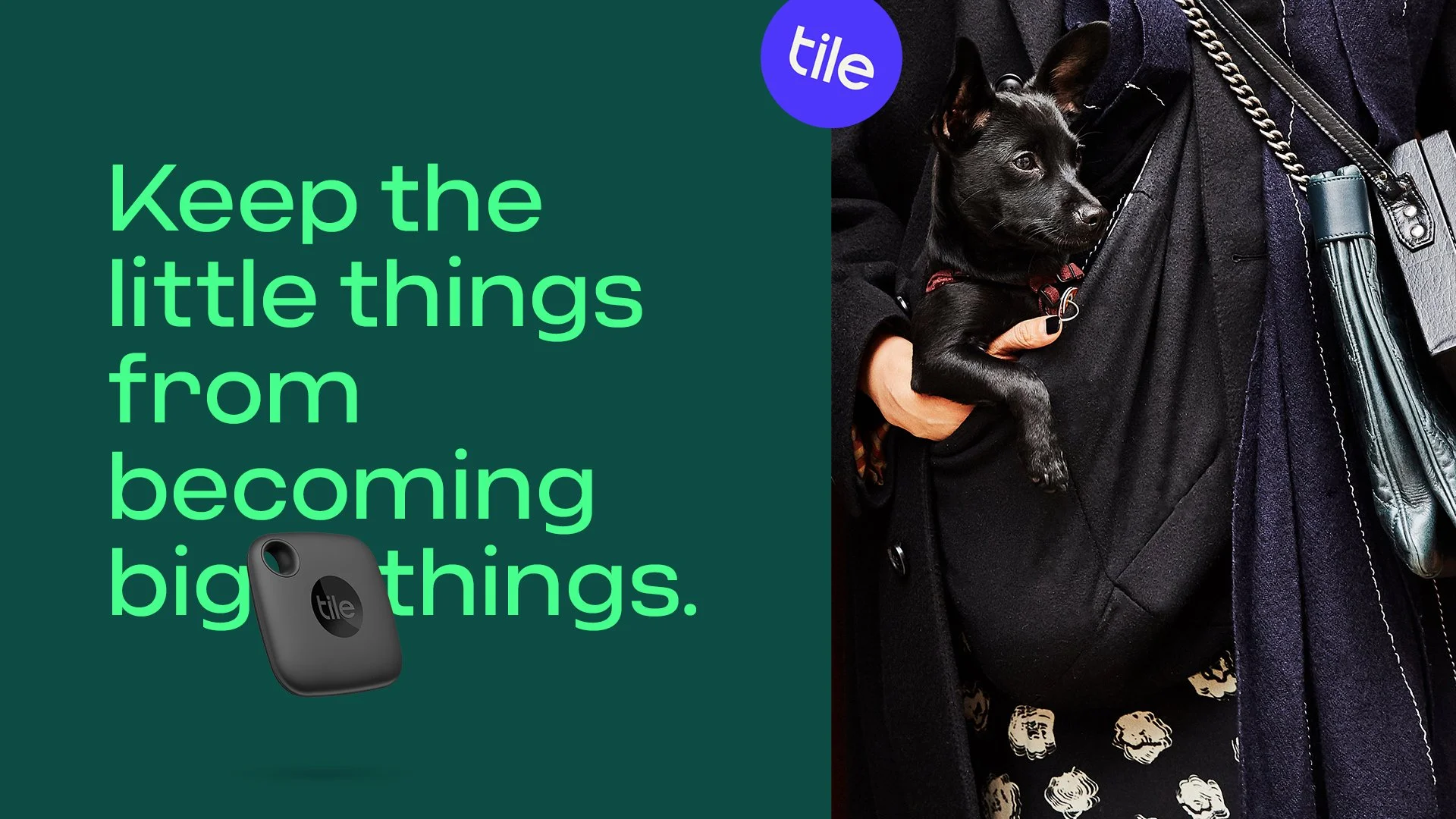
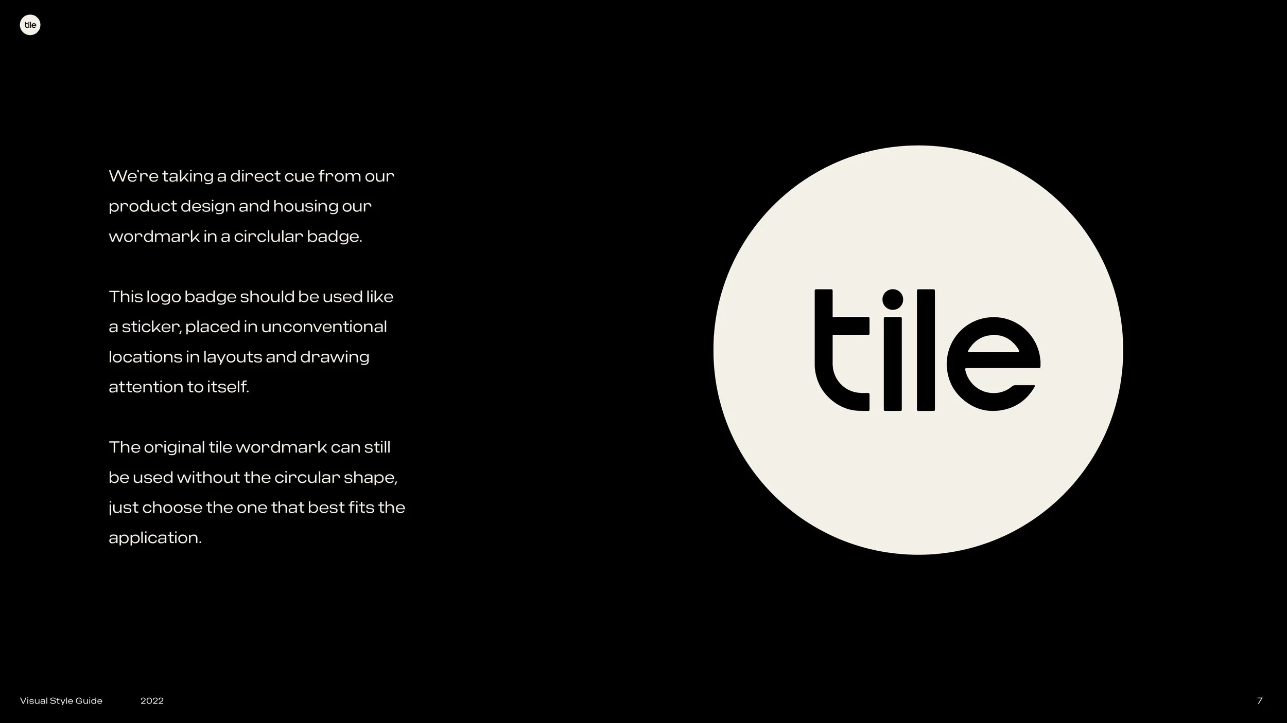
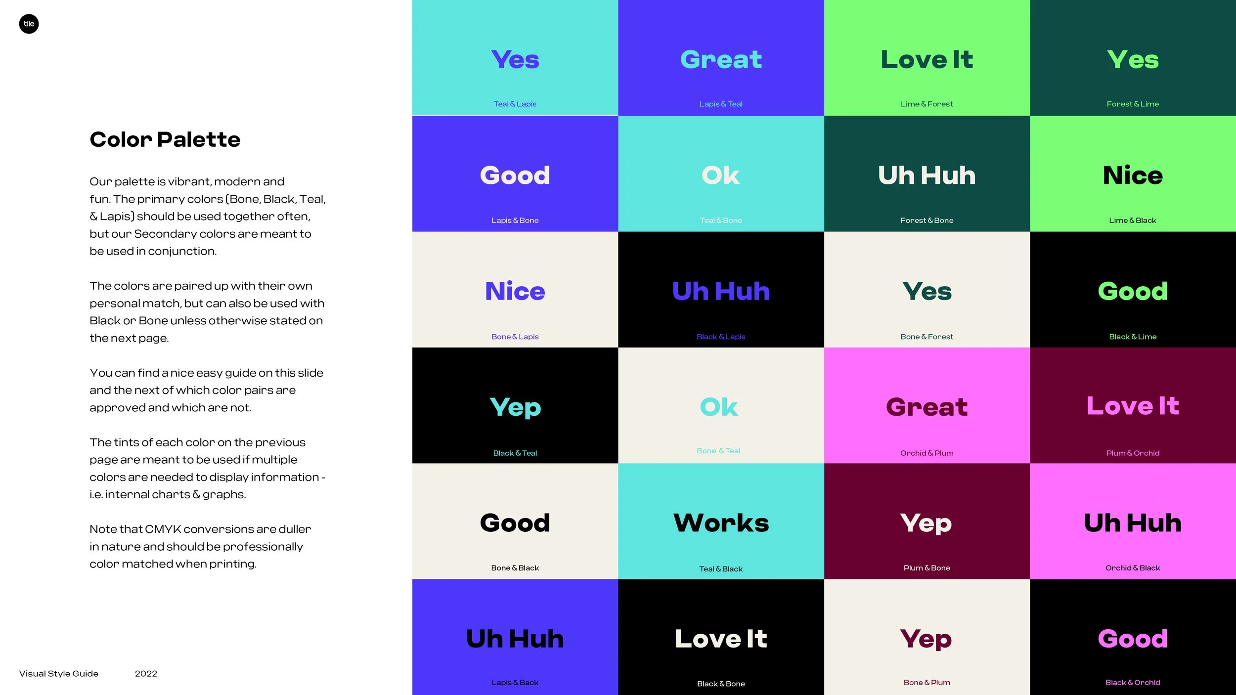
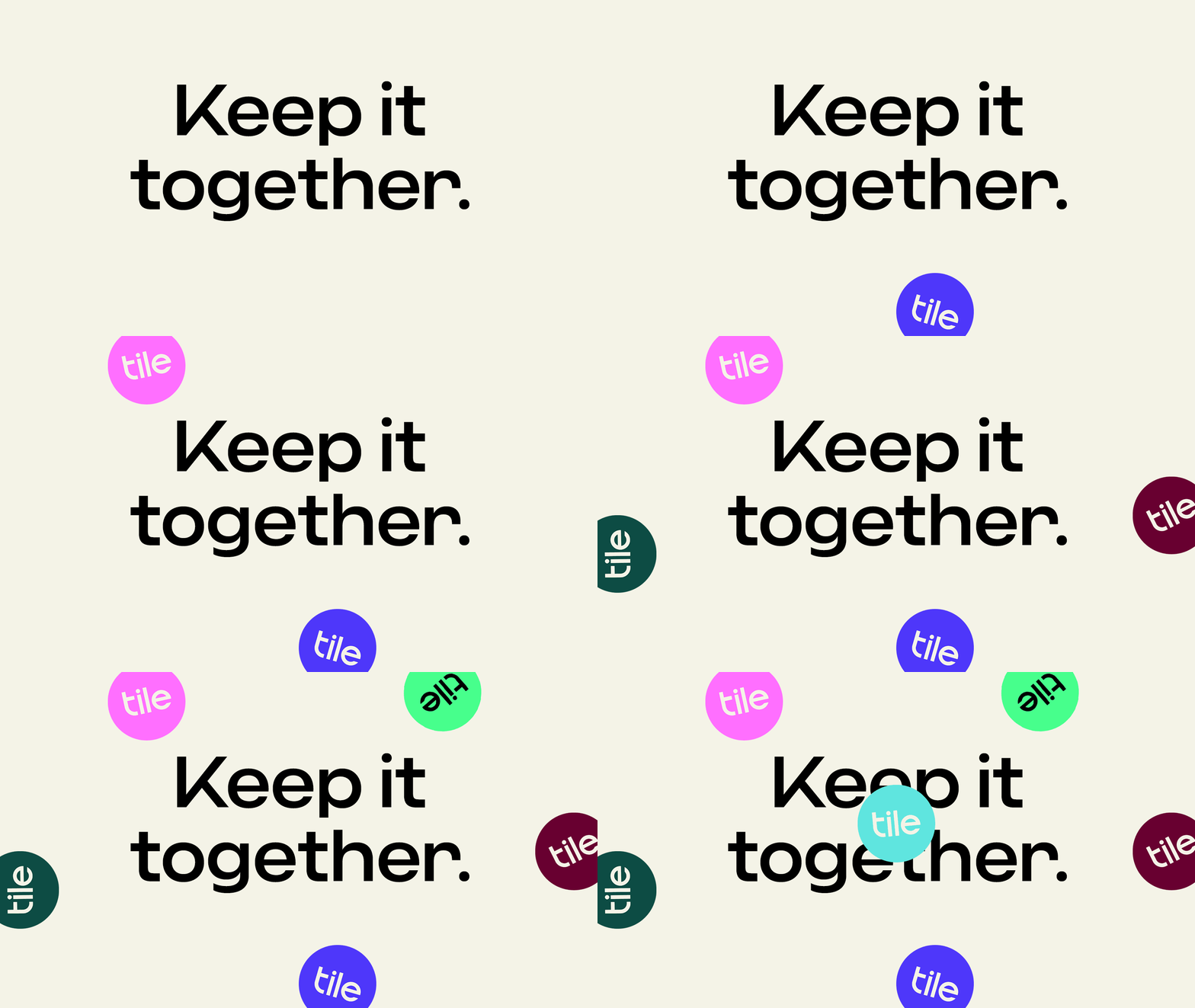
An overhaul of Tile’s key branding elements.
All photography is spec for style reference and not owned by Tile or myself.
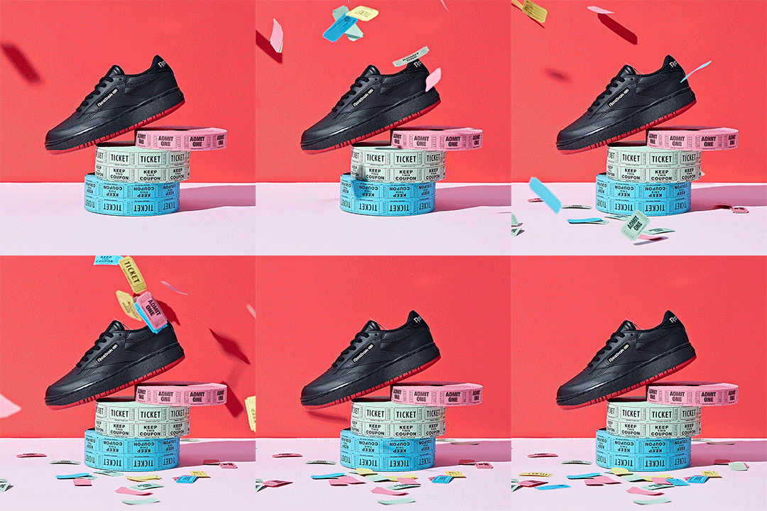
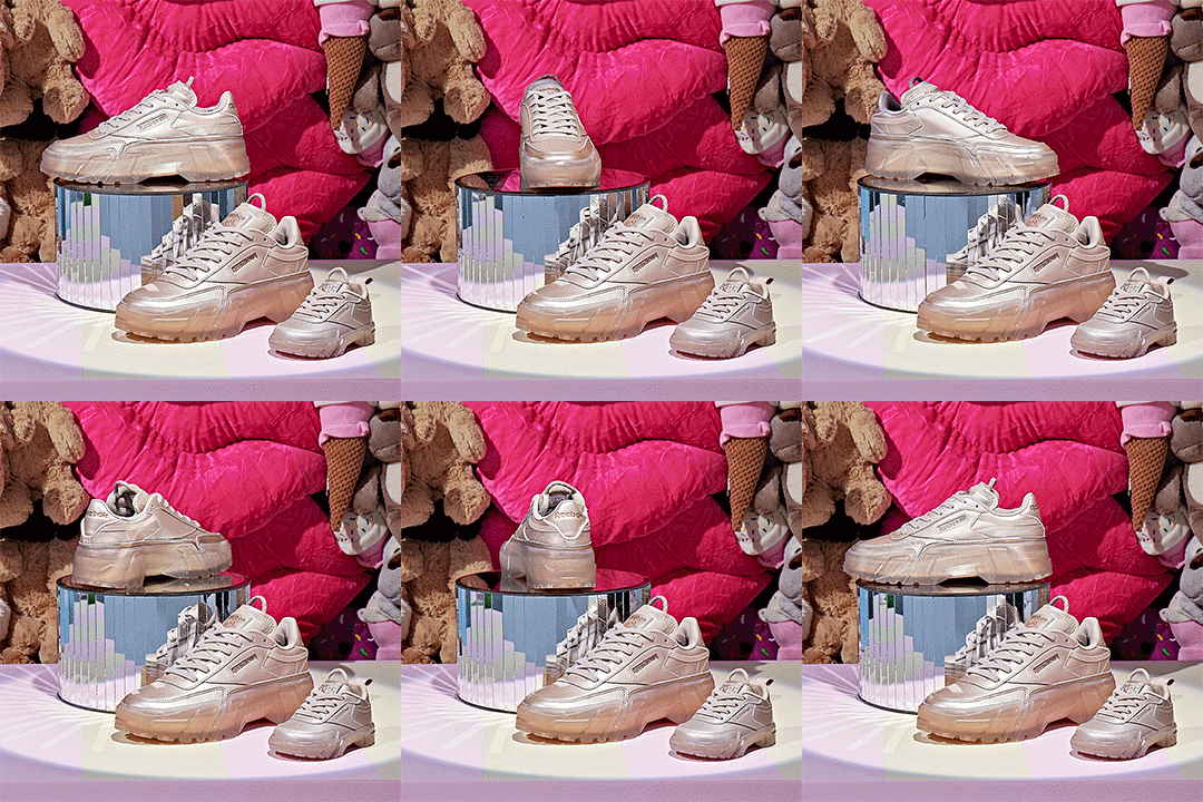
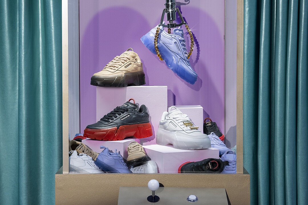
Mid-Covid Pandemic we were tasked with coming up with the next iteration of campaign for Cardi B x Reebok. The Spring Summer 2021 campaign was based on Coney Island type carnival games. I worked within an existing design system to update the elements for this concept, I was fully involved with the production aspect of the project, from the Cardi shoot the product shoot.
Miscellaneous Brand Marks
Akili is a first of its kind digital medicine for ADHD. I worked incredibly closely with the client to develop brand and design strategy.
Using the shapes of pills & capsules, I created an Identity system to push Akili out of the traditional idea of medicine, while retaining credibility in today’s Pharma landscape.
The treatment logos are created from the same pill & capsule shapes, using their own distinct brand colorways.
The logo shapes are also used in a collection of shades & outlines to create the graphic elements used in layout to show the interaction of patient & treatment.
Mixing offset shapes, lifestyle photography & studio photography helped to separate Akili from other Pharma brands.
Example of how the system translates into sub-brand communications