


/
1
2
3
4
5
6
7
8
·
·
·
·
·
·
·
·

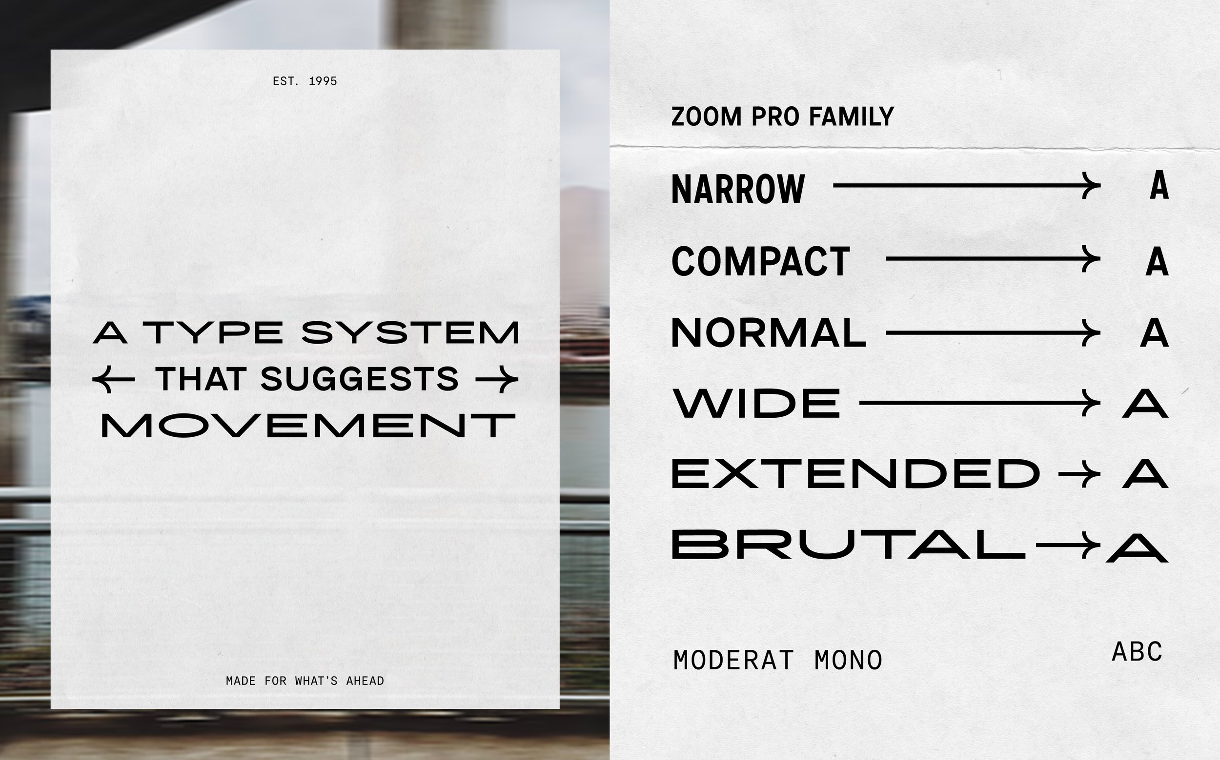
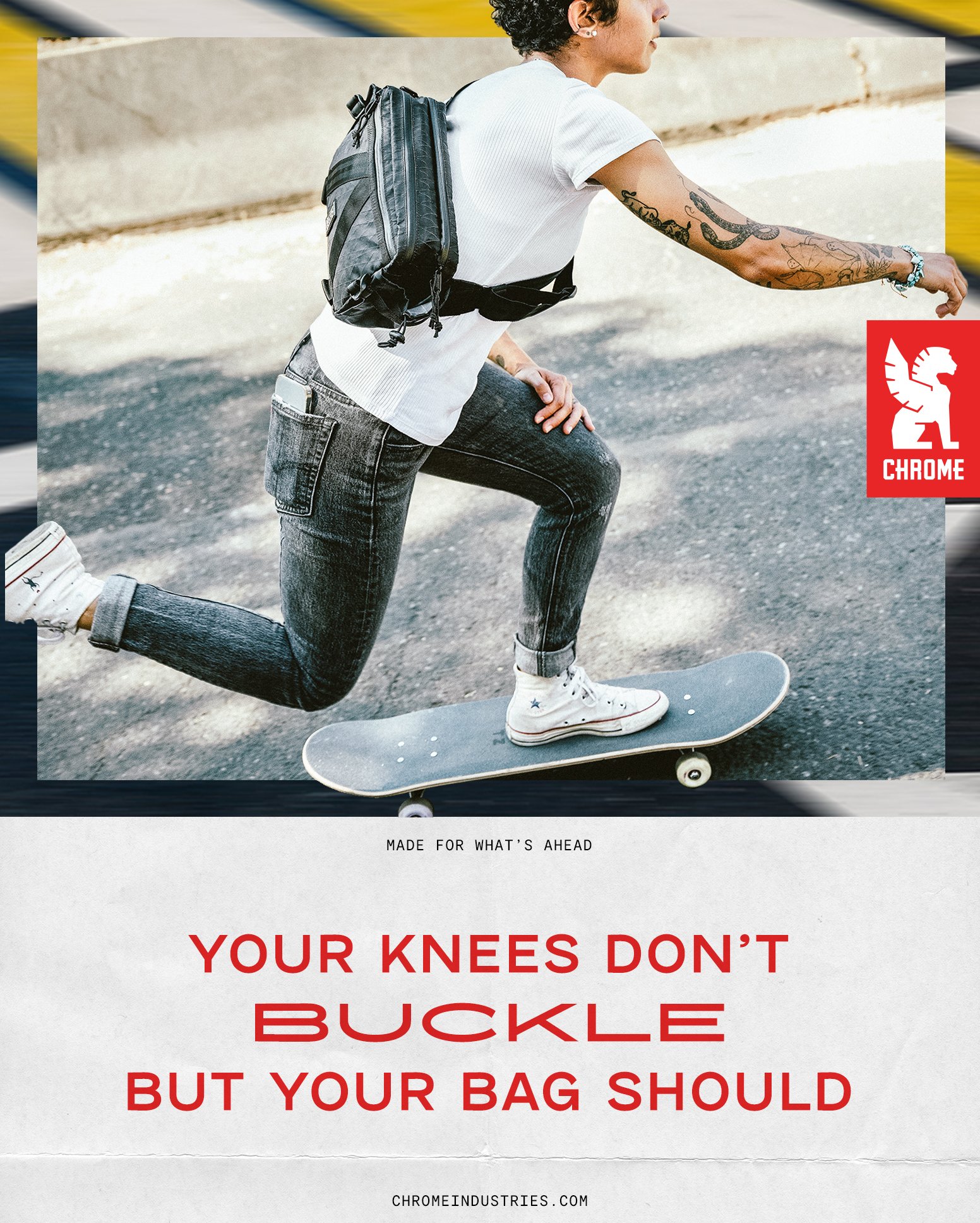
Chrome Industries wanted their branding to feel kinetic, like you were moving through city streets on a bike. I split photography is split into 2 areas; blurred scenery thats used as a textural border and traditional product & lifestyle photography. The typography stretches and moves, even when static.